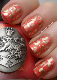
There are 2 things that are bugging me about it. First, the color combination. The inner spot color and base color looked much more different in the bottles but on the nail they blend together. I'll need much more contrasting colors next time. Second, I think I'll try a smaller dotting tool for the outside of the spots next time. They seem too thick and the spots are too close together.
I used Sarah at Chalkboard Nails tutorial/video HERE. Hers are so much prettier! Maybe I'll improve if I keep trying.
I received this gorgeous Nox Twilight Citrus polish in a swap with my friend, Gina, and that's what I decided to use for the base of this mani. It has a gorgeous golden shimmer and I love it! I'll do a comparison post later this week on it with a few more polishes in my stash to show you.
At least you can see the gorgeous shimmer in the base color!
And a bottle shot, because I'm a huge Twilight fan and am so happy to finally have a Nox Twilight polish!
I used:
Duri Rejuvacote
2 coats of Nox Twilight Citrus
Zoya Myrta and a dotting tool for the inner spots
China Glaze Passion and a dotting tool for the outer spots
NYC quick dry top coat
See what I mean about it not looking like there are 3 different colors on my nails? Oh well, next time! Thanks for reading!
Nox Twilight polishes can be purchased online here: http://twilightbeauty.com/noxtwilightnailpolish.aspx


I like them :) I know you can't see the middle colour, but it still definitely looks like leopard print. I tried using a dotting tool to do this for the first time the other day and it looked awful lol.
ReplyDeleteThat's adorable!
ReplyDeleteNo fail!! I really like the combination! I have seen them with thick and thin spots but I actually prefer the thicker ones because they look less perfect and drawn, more like an actual animal print.
ReplyDeleteI'm not really digging the color combo and I didn't even see the inside color until I read you notes. I think they look good though! The nice thing about nature is there are no hard and fast rules! Your spots look good :)
ReplyDeletei actually really like it!
ReplyDeleteSeriously I like yours loads more than the video you have linked. Yours are more unique, combination you don't see everyday, and look way too classy. x
ReplyDeleteSo nice!:)
ReplyDeleteThat's such a pretty combo of colors!
ReplyDeleteI'm drooling all over, this is amazing! :) x
ReplyDeleteIt still looks really pretty, but it's nice to know that things like this can happen to even the really talented bloggers, too!
ReplyDelete